Erock's Wishing Well
Page 1 of 3
Page 1 of 3 • 1, 2, 3 
 Erock's Wishing Well
Do you have any last graphics request seph because I guess now is the time? Also I was actually wanting to turn the bubble (skull with red balls which drain magic) into a poison purple mushroom from Mario Bros. Idk, it just seemed to be a fitting idea.
Also I have a few graphics the artist drew that I hadn't posted.
I asked the artist if there was anything that he could improve upon and he sent me these. However its up to you if you think they will make the game better.
The current galaxy guide is actually shown incorrectly. It needs to be flipped over the x axis. If you look at all the official logos its the other way around compared to the one currently in the game.
Here the artist tried to make the galaxy guide better.

Here he tried to make the fox tail actually look like a fox tail.

Here the shirt was made to look like conkers hoody

And I still have another complaint. In the gear dungeon there is that one gear at the start of the dungeon where you can fall though it and then later on that same gear acts as if it is solid.
Only reason I point this out again is because when I watched Andy's playthrough he actually said something about it as well. I can link the clip if you don't believe me. That probably should be fixed.
I still would like all the rest of the monsters who are using their original graphics to have them redrawn.
I was always a little disappointed that there were no xenomorphs in the game. You know the aliens from alien. So so check this out. Turn the evil sprite into that of a baby xenomorph! You could even have a body of a person/character leaded up against the wall and have the xenomorphs come out of their chests! But that would be optional.
I'm sorry, but it can't be helped and I will sent this to the artist to have it done.
I will assume 7 colors + 1 transparency if not told otherwise.
And there are others too that could be redrawn like for instance the Funny Stack. You could actually make it like Poki from Super Mario World or make it into a new monster, but currently I see that you just used the boss Blind's arm graphic as the head of the Fuzzy Stack. Surely we can do better than this.
Alright I will send the remaining monsters who are still using their original graphics to the pixel artist and then hopefully we can call it done.
Here I was able to throw in my tail and fist item into the pond. Normally I believe you can't or aren't supposed to be able to do this. At 2:20 I get the fist and I think that is like the no sword punching thing.
Here is a message tile that I never read before because I never knew it was a message.
Got some terrible noise during the moldrum fight. Maybe its just znes being buggy, but it the noise lasted until I left the dungeon.
The chomp chomps got stuck. Interesting. It might be as simple as just removing one of those blocks.
Here I'm doing puzzle dudes new puzzle because it was changed. I did do the twitch dungeon in the devs hideout, but didnt think to record it.
Also I have a few graphics the artist drew that I hadn't posted.
I asked the artist if there was anything that he could improve upon and he sent me these. However its up to you if you think they will make the game better.
The current galaxy guide is actually shown incorrectly. It needs to be flipped over the x axis. If you look at all the official logos its the other way around compared to the one currently in the game.
Here the artist tried to make the galaxy guide better.

Here he tried to make the fox tail actually look like a fox tail.

Here the shirt was made to look like conkers hoody

And I still have another complaint. In the gear dungeon there is that one gear at the start of the dungeon where you can fall though it and then later on that same gear acts as if it is solid.
Only reason I point this out again is because when I watched Andy's playthrough he actually said something about it as well. I can link the clip if you don't believe me. That probably should be fixed.
I still would like all the rest of the monsters who are using their original graphics to have them redrawn.
I was always a little disappointed that there were no xenomorphs in the game. You know the aliens from alien. So so check this out. Turn the evil sprite into that of a baby xenomorph! You could even have a body of a person/character leaded up against the wall and have the xenomorphs come out of their chests! But that would be optional.
I'm sorry, but it can't be helped and I will sent this to the artist to have it done.
I will assume 7 colors + 1 transparency if not told otherwise.
And there are others too that could be redrawn like for instance the Funny Stack. You could actually make it like Poki from Super Mario World or make it into a new monster, but currently I see that you just used the boss Blind's arm graphic as the head of the Fuzzy Stack. Surely we can do better than this.
Alright I will send the remaining monsters who are still using their original graphics to the pixel artist and then hopefully we can call it done.
Here I was able to throw in my tail and fist item into the pond. Normally I believe you can't or aren't supposed to be able to do this. At 2:20 I get the fist and I think that is like the no sword punching thing.
Here is a message tile that I never read before because I never knew it was a message.
Got some terrible noise during the moldrum fight. Maybe its just znes being buggy, but it the noise lasted until I left the dungeon.
The chomp chomps got stuck. Interesting. It might be as simple as just removing one of those blocks.
Here I'm doing puzzle dudes new puzzle because it was changed. I did do the twitch dungeon in the devs hideout, but didnt think to record it.

Erockbrox
- Since : 2013-02-05
 Wishing Well
I now understand why you can hookshot to walls in this dungeon. Its because they are really blocks. Gotcha.

Here there was a tile that was left behind.
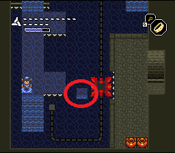
Here there is a peg that if upward and let the player push on it. It looks like your pushing on an invisible object when the layer is added. I'm removing one of the layers here to show this as you cant see this normally.
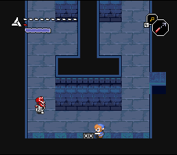
I never noticed this before, but the shooters here have glitched graphics. Not the bullets but the shooters on the walls.
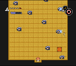
Here is another one of those pegs embedded into the walls. I assuming this was placed here by accident.

In the upper right corner you can push the block on top of the bomb graphic. Once done the graphic display incorrectly. If you keep on pushing this block you could push it on top of that other bomb graphic too. So the two bombs placed against the wall need to be removed.
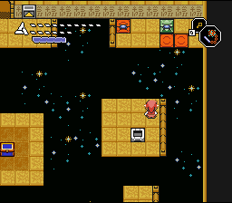
In one of the rift areas when going from one screen to another this strange graphic appears. You don't have to fix this because its very minor and I never noticed it until now, but I'm just making it aware.
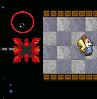

Here there was a tile that was left behind.

Here there is a peg that if upward and let the player push on it. It looks like your pushing on an invisible object when the layer is added. I'm removing one of the layers here to show this as you cant see this normally.

I never noticed this before, but the shooters here have glitched graphics. Not the bullets but the shooters on the walls.

Here is another one of those pegs embedded into the walls. I assuming this was placed here by accident.

In the upper right corner you can push the block on top of the bomb graphic. Once done the graphic display incorrectly. If you keep on pushing this block you could push it on top of that other bomb graphic too. So the two bombs placed against the wall need to be removed.

In one of the rift areas when going from one screen to another this strange graphic appears. You don't have to fix this because its very minor and I never noticed it until now, but I'm just making it aware.

Last edited by Erockbrox on Sun 13 Nov 2016 - 9:30; edited 3 times in total

Erockbrox
- Since : 2013-02-05
 Re: Erock's Wishing Well
Okay, well I just sent an e-mail to the pixel artist with some of the last remaining graphics that the hack will benefit from.
I don't know when he will finish them, but I'll just post them here once he finishes them.
Also,what purpose did the Tardis have in the garden of eden? You know the one by Tingle. It seems as if that one was never used.
Someone said that the lumber jacks were made into strippers. Did this ever make it into the game? I never saw it. Was there a way into the strip club?

Erockbrox
- Since : 2013-02-05
 Re: Erock's Wishing Well
The lumber hacks were gfx-changed into the two transvestites behind the strip club.Someone said that the lumber jacks were made into strippers. Did this ever make it into the game? I never saw it. Was there a way into the strip club?
No, it is just decoration, you can never enter.Was there a way into the strip club?

Puzzledude
- Since : 2012-06-20
 Re: Erock's Wishing Well
I just checked the trans people behind the strip club. I have to admit that this was funny as hell.
I recorded some more videos thinking there was more original content, but it was apparently only this one puzzle.
Also fix that gear platform that you fall through in the gear dungeon.
I recorded some more videos thinking there was more original content, but it was apparently only this one puzzle.
Also fix that gear platform that you fall through in the gear dungeon.

Erockbrox
- Since : 2013-02-05
 Re: Erock's Wishing Well
Oh, so that dungeon was scrapped?Puzzledude wrote:The lumber hacks were gfx-changed into the two transvestites behind the strip club.Someone said that the lumber jacks were made into strippers. Did this ever make it into the game? I never saw it. Was there a way into the strip club?No, it is just decoration, you can never enter.Was there a way into the strip club?
Mr.x- Fluteboy

- Since : 2014-04-10
 Re: Erock's Wishing Well
That peach castle for example is way beyond all my original expectations for this hack.
Actually this one single decision was really a big turning point for the hack. The original space idea was okay, but the SM 64 castle was a slam dunk and put the hack on the map to be forever remembered. So it was an excellent design choice.

Erockbrox
- Since : 2013-02-05
 Re: Erock's Wishing Well
Here are some last suggestions things that need to be done.

Erockbrox
- Since : 2013-02-05
 Re: Erock's Wishing Well
Recently Seph asked me if I had any things remaining for the game to submit them and so that's what this is all about here.
And now for the newest pixel art from the pixel artist. I will explain each one from top to bottom. One the right are the originals.

The alien baby is to replace the left, right evil fish.
I got flute boy or Bart Simpson redrawn. I think the new version looks a lot better.
This is a replacement for the wall bubble or fireblade graphic. The one we currently have just bugs me as it doesn't look like it fits with the rest of the graphics. And really when the current graphic was made it was just the small bubble graphic from the skull bubble magic thing and slightly modified.
I asked the artist if he could draw an alternative version of the fish.
The heart that goes inside the ghost. Originally the heart was too small and its hit box is 16x16 so I drew a circle around the heart, but I never really liked this. So I asked the artist to redraw the heart bigger. I hope this works better.
Fuzzy stack was replaced with Blind's hand and fireball graphics. While this monster almost looks original, its not since it just recycles graphics already used in the game. I've always wanted the Fuzzy Stack to be like Poki from the Mario Bros universe and so here you go.
Here is a tiny mushroom. I was wanting the skull bubble magic draining enemy to be different. The only thing I could think of is to make it sort of like the poison mushroom from the Mario Bros games. So maybe just leave the skull, but replace the red things around it with this tiny poison mushroom.
The robot enemy's head was way too big when he turns sideways. I asked the artist to draw a new sideways head that is supposed to be more representative of the robot. If this doesn't fit just let me know the details an order to make it fit.
Ah, the Substation logo. You know this has bugged me for sometime. I think the new version looks a lot better.
I asked the artist to draw an alternate version of the bee.
I asked the artist to draw the water ball that rises up out of the water and flys at you to instead grow spikes and stay as a ball of some sort. The only thing is that I don't know if its really any better than the current one. So I'm on the fence with this one.
There still is another batch of animations/drawing that the guy is still working on. So look forward for another update on graphics improvements.

And now for the newest pixel art from the pixel artist. I will explain each one from top to bottom. One the right are the originals.

The alien baby is to replace the left, right evil fish.
I got flute boy or Bart Simpson redrawn. I think the new version looks a lot better.
This is a replacement for the wall bubble or fireblade graphic. The one we currently have just bugs me as it doesn't look like it fits with the rest of the graphics. And really when the current graphic was made it was just the small bubble graphic from the skull bubble magic thing and slightly modified.
I asked the artist if he could draw an alternative version of the fish.
The heart that goes inside the ghost. Originally the heart was too small and its hit box is 16x16 so I drew a circle around the heart, but I never really liked this. So I asked the artist to redraw the heart bigger. I hope this works better.
Fuzzy stack was replaced with Blind's hand and fireball graphics. While this monster almost looks original, its not since it just recycles graphics already used in the game. I've always wanted the Fuzzy Stack to be like Poki from the Mario Bros universe and so here you go.
Here is a tiny mushroom. I was wanting the skull bubble magic draining enemy to be different. The only thing I could think of is to make it sort of like the poison mushroom from the Mario Bros games. So maybe just leave the skull, but replace the red things around it with this tiny poison mushroom.
The robot enemy's head was way too big when he turns sideways. I asked the artist to draw a new sideways head that is supposed to be more representative of the robot. If this doesn't fit just let me know the details an order to make it fit.
Ah, the Substation logo. You know this has bugged me for sometime. I think the new version looks a lot better.
I asked the artist to draw an alternate version of the bee.
I asked the artist to draw the water ball that rises up out of the water and flys at you to instead grow spikes and stay as a ball of some sort. The only thing is that I don't know if its really any better than the current one. So I'm on the fence with this one.
There still is another batch of animations/drawing that the guy is still working on. So look forward for another update on graphics improvements.

Erockbrox
- Since : 2013-02-05
 Re: Erock's Wishing Well
Made a video addressing some more things and comments and things and stuffs.

Erockbrox
- Since : 2013-02-05
 Re: Erock's Wishing Well
*lol, I hope SePH found this funny as well 
I quote what he wrote in the admin forum:
So, the points left are really easy to implement (2 hours SePH?), but it sometimes happens that projects are dropped 5 meters in front of the goal line for a short while (due to a burn-out or whatsoever). I really hope that SePH gets his motivation back soon. I mean not only him, but we all put enormeous energy into this project to let it happen:
Euclid and me with endless coding, Puzz with dungeon design, qwerty with the msu-1 tracks, you with all your (unwanted or not) suggestions, all the beta players. It would be a shame if this project was abandoned, but I am sure this will not happen. I think SePH knows about the obligation he owes all us Conker fans out there to let 1.1 release happen!
Just give him a bit more time (and hope that he won't travel to Cuba and gets an airplane crash or whatever). Keep faith!

I quote what he wrote in the admin forum:
1- add patty message in vaati
''Patty: your swords fucking break pots!''
2- fix space blocks boomerang go through
3- add bg2 things in parallel tower ruins in stairs to fix glitch
4- add exit underverse!
5- fix the crc
these above, plus add all that 'final' erock stuff...
but quite honestly ain't in the mood for it.
So, the points left are really easy to implement (2 hours SePH?), but it sometimes happens that projects are dropped 5 meters in front of the goal line for a short while (due to a burn-out or whatsoever). I really hope that SePH gets his motivation back soon. I mean not only him, but we all put enormeous energy into this project to let it happen:
Euclid and me with endless coding, Puzz with dungeon design, qwerty with the msu-1 tracks, you with all your (unwanted or not) suggestions, all the beta players. It would be a shame if this project was abandoned, but I am sure this will not happen. I think SePH knows about the obligation he owes all us Conker fans out there to let 1.1 release happen!

Just give him a bit more time (and hope that he won't travel to Cuba and gets an airplane crash or whatever). Keep faith!

Conn
- Since : 2013-06-30

Erockbrox
- Since : 2013-02-05
 Re: Erock's Wishing Well
Erockbrox wrote:This is what I find so funny.
Seph: This game will be released on a certain date no matter what!
Reality: Ah, fuck it. A month after the expected date and still nothing.
Please, no drama, Seph is understandably exhausted from this project. I think we're all immensely appreciative of the work that went into the game and for the fact that it was indeed released though I can understand if you, and possibly a few others, will continue to feel underwhelmed until the project hits maximum spread and appeal. Indeed I wish that Conker got the same sort of treatment as did Pokemon Prism after its cancellation, what with a community forming around it and a highly tuned in playthrough in Twitch plays Pokemon Prism.
sumotherguy- Cucumber

- Since : 2015-09-22
 Re: Erock's Wishing Well
Erockbrox wrote:This is what I find so funny.
Seph: This game will be released on a certain date no matter what!
Reality: Ah, fuck it. A month after the expected date and still nothing.
This isn't going to make it happen any sooner. You need to find a better way to vent your frustrations. Preferably one that doesn't drive anyone else crazy.

SunGodPortal
- Since : 2015-01-26
 Re: Erock's Wishing Well
Some news. The pixel artist guy that I've hired for additional artwork for the game just sent me some more stuff. Here is a preview.

Once I pay the guy I'll post the unblurred images.
Looks like Obi Wan's dead ghost will finally make it into the game after all. Also the fire rod has been changed so that the top of it is a tiny red and white mushroom and the in game hammer actually looks like the icon in the items menu.

Once I pay the guy I'll post the unblurred images.
Looks like Obi Wan's dead ghost will finally make it into the game after all. Also the fire rod has been changed so that the top of it is a tiny red and white mushroom and the in game hammer actually looks like the icon in the items menu.

Erockbrox
- Since : 2013-02-05
 Re: Erock's Wishing Well
The game final update (from me) is rdy to roll out once you submit that final stuff.
Founder
- Since : 2012-06-19
 Re: Erock's Wishing Well
Okay here is the latest artwork from the pixel artist.
My motivation behind a lot of these was simply to try and replace things that were still using their original graphics. Whenever you give something new graphics it makes the game feel really fresh.
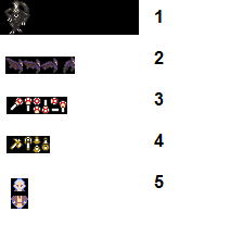
Now, let me explain these.
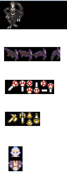
1) This is a full size Alien from the movies Aliens. I figured that since we now have a baby alien to replace the right evil sprite that is was only fitting to have an adult alien too. This Alien is to replace the Armos Knight's graphics in the boss rush leading up to dark Gannon.
2) I believe that the vulture was replaced with the bat version of Gannon's graphics. I believe that you encounter the vulture sprite in the halls of pain. These new bat graphics are to replace the current bat graphics for the vulture. Actually I think the frame on the far right is the gannon bat frame where he breaks though the floor/pyramid. Maybe you could use these for the gannon bat phase too.
3) It always bugged me that the fire mushroom was still using the original fire rods graphics. So why not have a rod, but on the top of it, it has a tiny mushroom on it. This weapon should make more sense now.
4) I asked the artist to draw new graphics for the in game hammer animations. I asked him to match that of the original icon in the item menu. Honestly, I don't know if he got all the correct frames here or not. If this has to be redrawn then I think it should look more like Thor's current hammer design like in the Avengers movies.
5) Obi Wan Kenobi from star wars! He is the guy preventing you from getting the red light saber. Originally his graphics were that of a skeleton then it was changed to that of some final fantasy character. Now, we actually have appropriate graphics for him. Now, when people play the game they will actually be able to make sense of this room. It would really be cool if we could apply that translucent effect to his sprite in this room to make him really appear as if he is a ghost.
Here is an enlarged version of the image above.
I actually asked the pixel artist to redraw tons of other stuff too, so I don't know if he will send more in the future.
My motivation behind a lot of these was simply to try and replace things that were still using their original graphics. Whenever you give something new graphics it makes the game feel really fresh.

Now, let me explain these.
1) This is a full size Alien from the movies Aliens. I figured that since we now have a baby alien to replace the right evil sprite that is was only fitting to have an adult alien too. This Alien is to replace the Armos Knight's graphics in the boss rush leading up to dark Gannon.
2) I believe that the vulture was replaced with the bat version of Gannon's graphics. I believe that you encounter the vulture sprite in the halls of pain. These new bat graphics are to replace the current bat graphics for the vulture. Actually I think the frame on the far right is the gannon bat frame where he breaks though the floor/pyramid. Maybe you could use these for the gannon bat phase too.
3) It always bugged me that the fire mushroom was still using the original fire rods graphics. So why not have a rod, but on the top of it, it has a tiny mushroom on it. This weapon should make more sense now.
4) I asked the artist to draw new graphics for the in game hammer animations. I asked him to match that of the original icon in the item menu. Honestly, I don't know if he got all the correct frames here or not. If this has to be redrawn then I think it should look more like Thor's current hammer design like in the Avengers movies.
5) Obi Wan Kenobi from star wars! He is the guy preventing you from getting the red light saber. Originally his graphics were that of a skeleton then it was changed to that of some final fantasy character. Now, we actually have appropriate graphics for him. Now, when people play the game they will actually be able to make sense of this room. It would really be cool if we could apply that translucent effect to his sprite in this room to make him really appear as if he is a ghost.
Here is an enlarged version of the image above.

I actually asked the pixel artist to redraw tons of other stuff too, so I don't know if he will send more in the future.

Erockbrox
- Since : 2013-02-05
 Re: Erock's Wishing Well
3. The rod graphics are shared with both rods (fire/ice).
4. The hammer is missing four tiles.
4. The hammer is missing four tiles.
Founder
- Since : 2012-06-19
 Re: Erock's Wishing Well
We could use the new graphics for both fire and ice rod, at least its something different.
Also sent the artist the last 2 tiles to draw for the hammer. it was hard to see them in yychr and an easy miss.
you can always release the game now and do graphics upgrade later if you want.
Also sent the artist the last 2 tiles to draw for the hammer. it was hard to see them in yychr and an easy miss.
you can always release the game now and do graphics upgrade later if you want.

Erockbrox
- Since : 2013-02-05
Page 1 of 3 • 1, 2, 3 
Page 1 of 3
Permissions in this forum:
You cannot reply to topics in this forum


 by
by 


